Charts and graphs
Writers tend to reuse particular words repeatedly because of limited vocabulary. A typical example is overuse of the verb rise or decline in a writing task that asks for a description of changes and trends in a graph, table or diagram.
Assignment
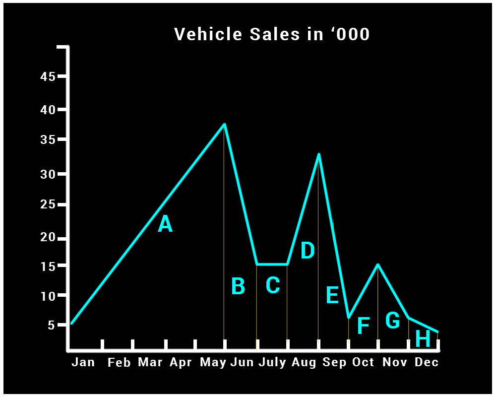
The sales department sent the chart below to create a presentation for the CEO regarding last year’s sales.
Step 1
For this purpose you would like to browse through all collocations relating to movement.
Select Context Group under Search in and enter the keyword (movement) in Advanced Search as shown below:
We can check in the toolkit for descriptive phrases for various types of movements. Let us first check for Movement (Downward)
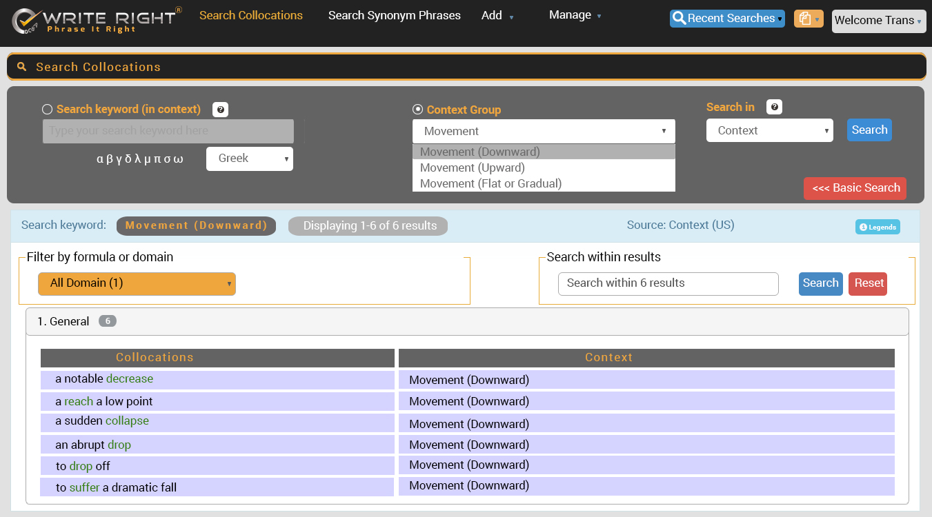
We can choose the following from above:
- to drop off
- to suffer a dramatic fall
Similarly, we can choose the following from Movement (Upward):
- to rise sharply
- to rise steadily
- to reach a peak
- to make a significant recovery
Lastly, we can choose the following from Movement (Flat or Gradual):
- a slight downturn
- to level off
We can use the following descriptive phrases for various sections in the chart.
| A | to rise steadily |
| B | to reach a peak |
| C | to drop off |
| D | to level off |
| E | to rise sharply |
| F | to suffer a dramatic fall |
| G | to make a significant recovery |
| H | a slight downturn |
Step 2
We can now prepare the following slide content for the presentation.
The number of vehicles sold by our company rose steadily in the first five months of the year (from January to May) and reached their peak in June. Unfortunately, sales dropped off in July and levelled off in August. After rising sharply during September, sales suffered a dramatic fall in October but made a significant recovery in November. However, the year closed with a slight downturn.